Timeline
2024.7-2024.9
Role
UX Designer
Team
Me- UX Designer (onboarding another one later)
1 Boss
3 Developers
Marketing Manager
Approach

Achievement
Establish Design system


Redesign
Ensured visual consistency
across iOS, Android, Web, and marketing materials through a unified design system.
Design-dev efficiency by 30%
by reusable tokens and components.
Users Navigation errors by 40%
through streamlined IA redesign.
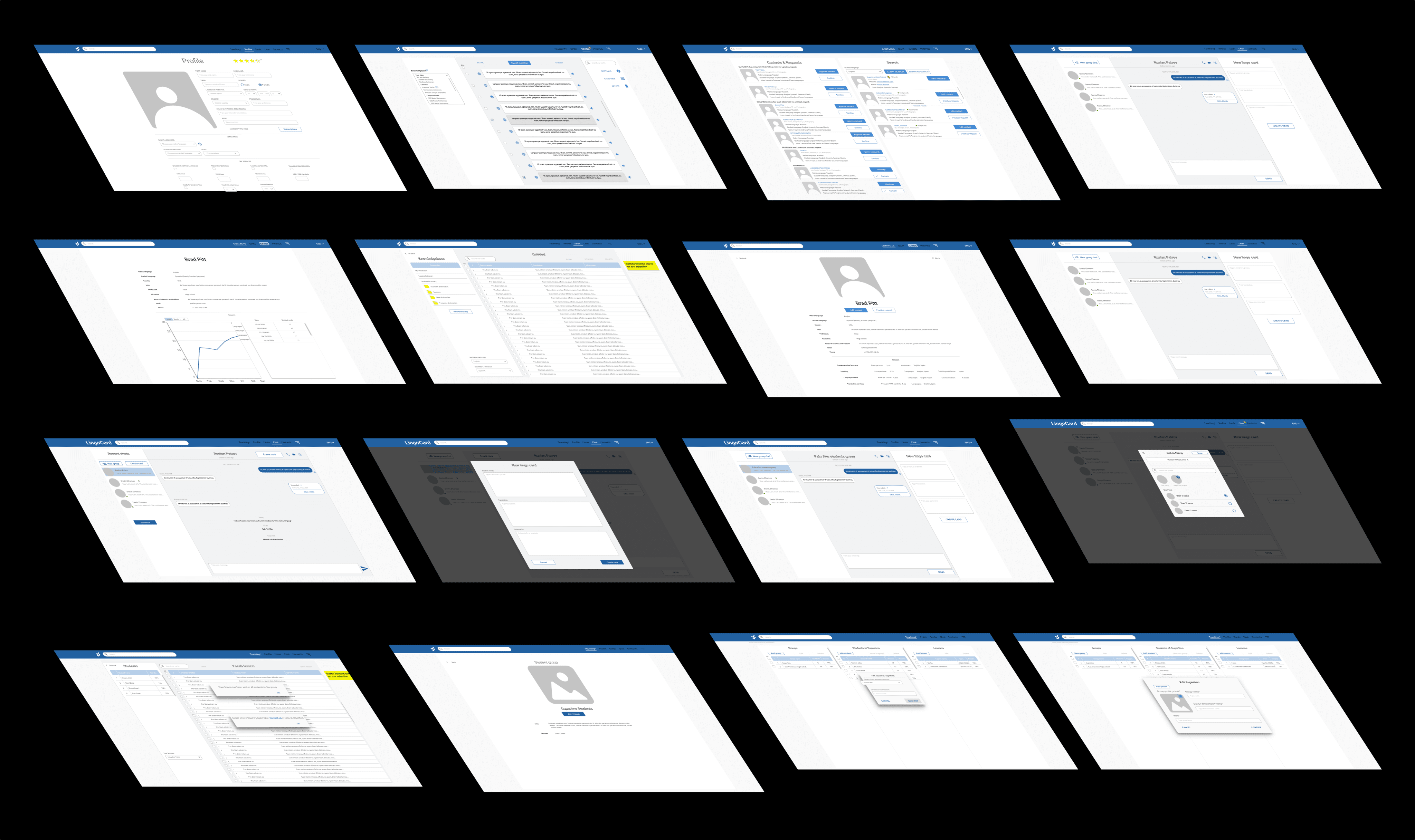
🐣 First I designed a quick MVP based on the PRD.
💬 This version is only built for pitching and early testing.
🌟 NDA applies — only partial designs shown.
Stakeholders
Boss
I want my product outstanding and competetive, with unique branding!

User
I want to learn a second language and make friends in a way that's both fun and professional!

Hey There!👋
Engineer
Want a single source of truth to ensure consistent, scalable UI and seamless collaboration within the design system.
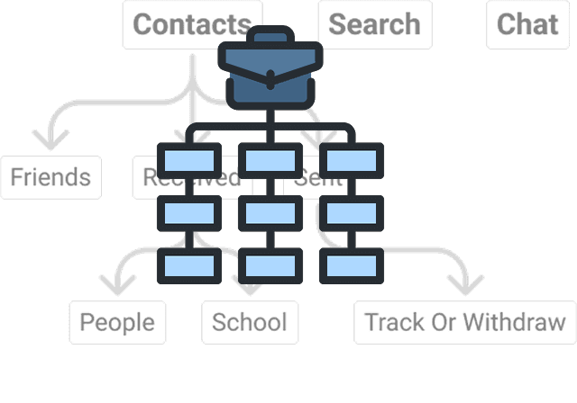
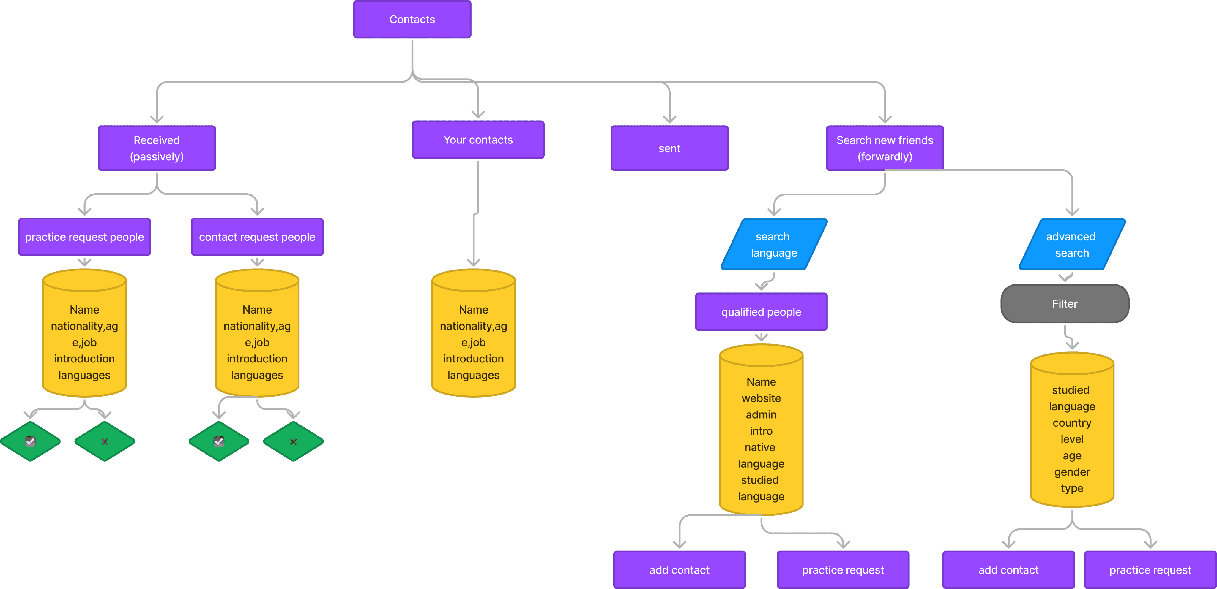
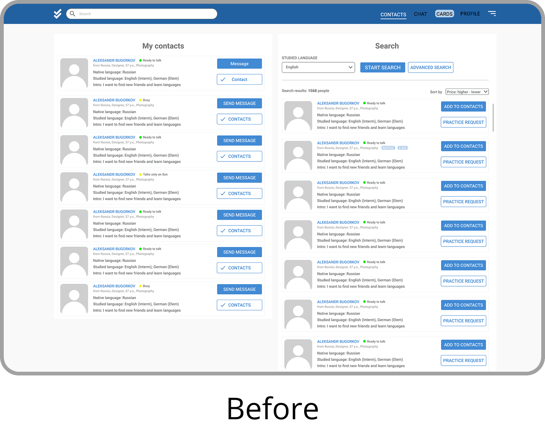
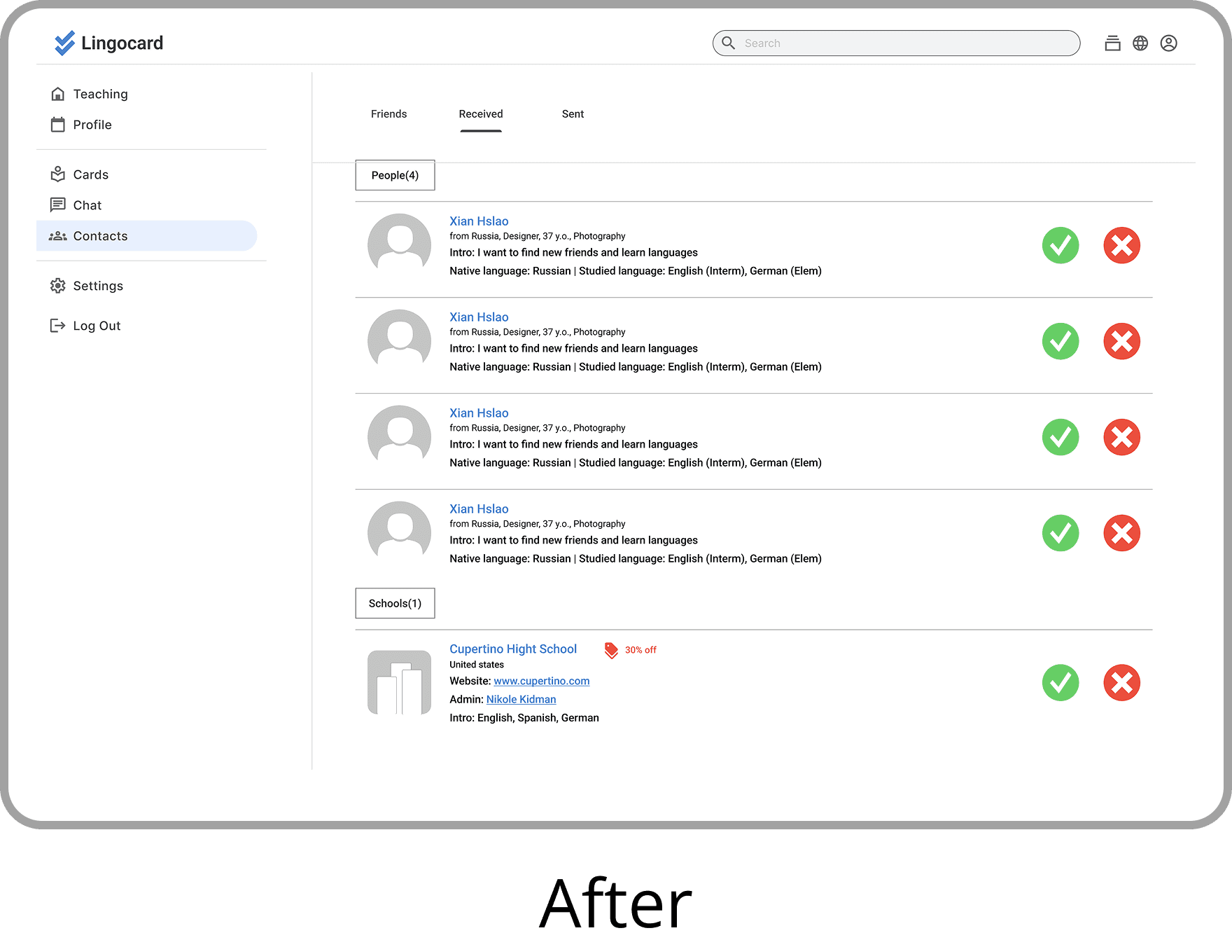
Heuristic Evaluation
(Take contacts page for example)


Overall problem
UI Inconsistency
-Icons, cards, and grid misalign with 🔗 Material Design 3 standards.
-Branding strategy is unclear
Navigation
Poor hierarchy between primary and secondary menus, causing navigation inefficiency.

Solution
-Align design system across iOS, Android, and Web
-Refine existing design for consistency
-Create information architecture for future product growth
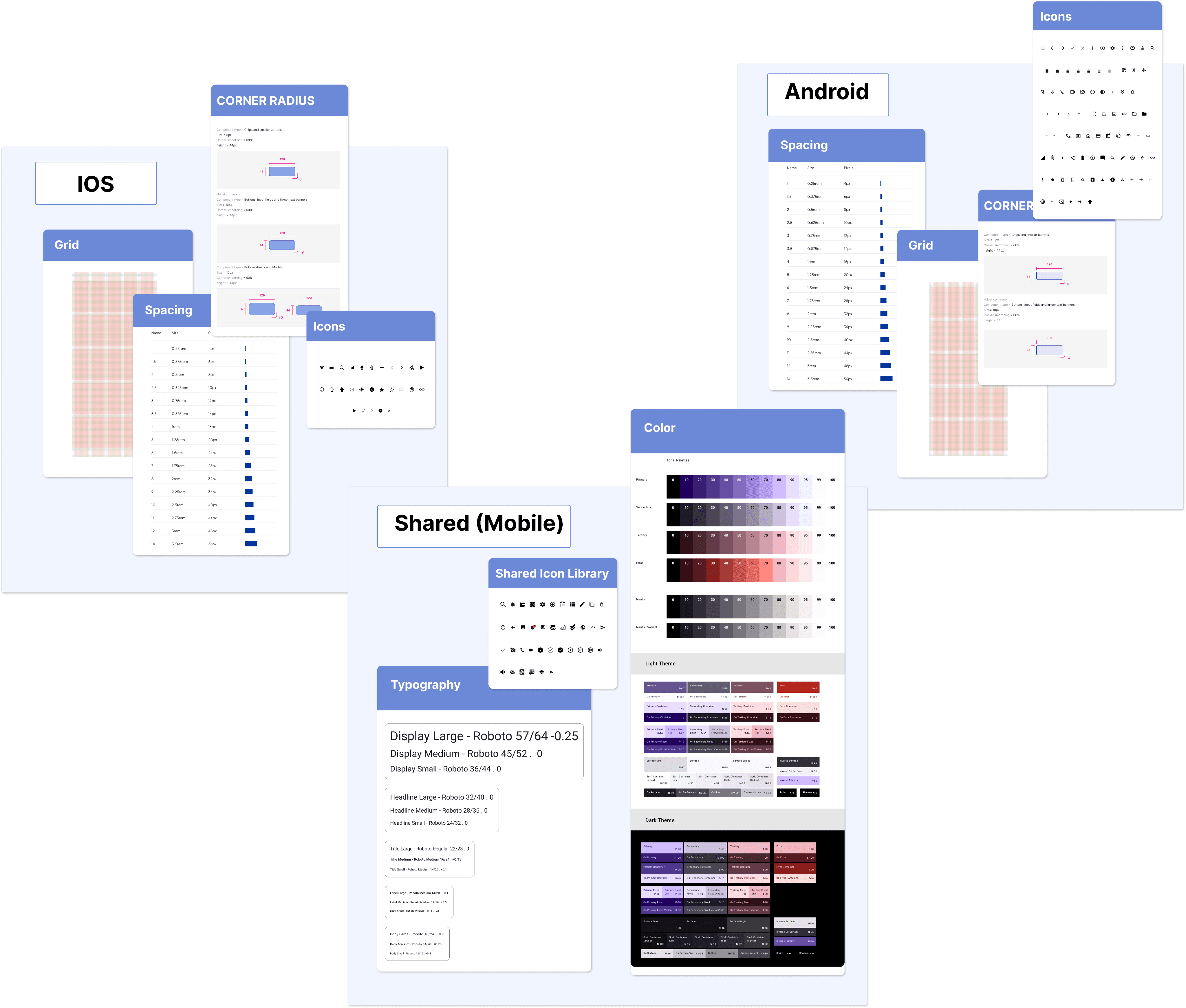
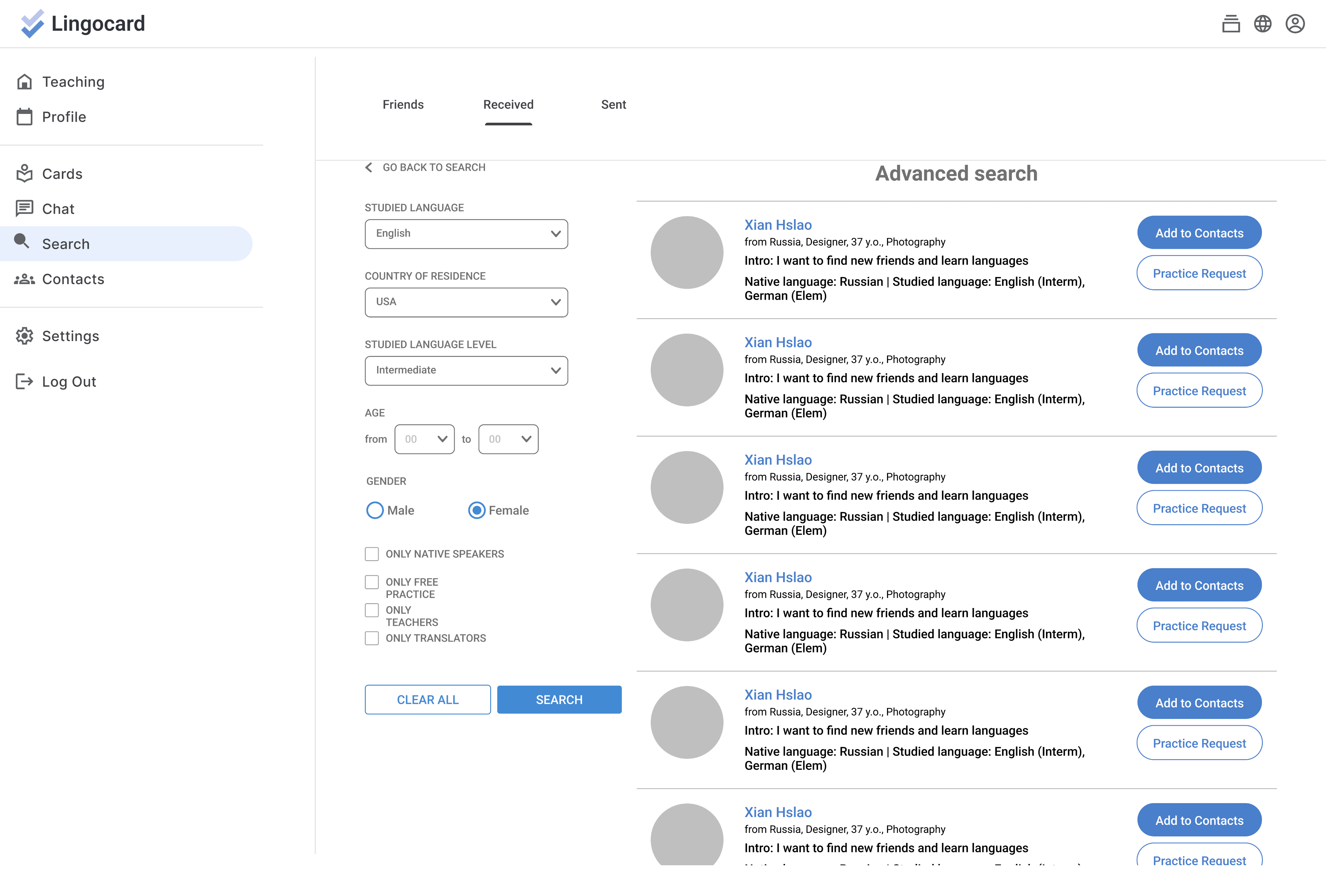
Set Design System( IOS, Android, Web)
Purpose: align with the latest industrial guide.
Atomic Design: Atoms > Molecules >Organisms > Templates > Pages

Web


Mobile Device (IOS & Android)


Auditing Principal
🪡 Consistency: Across all platform (IOS & Android)
𝌡 Adaptable: Try to make less modification
🔍 Readable: evaluated w/ actual size, making sure the font size is easy to read.
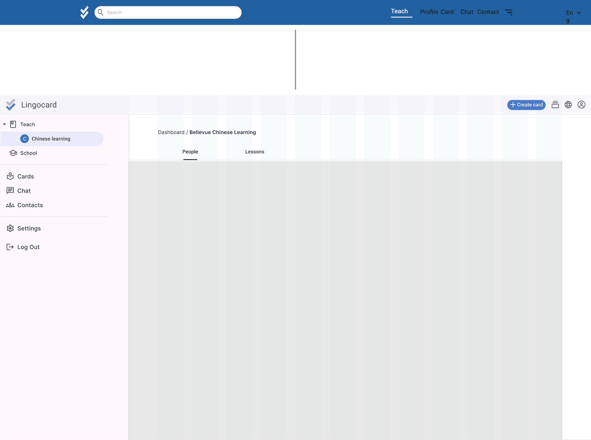
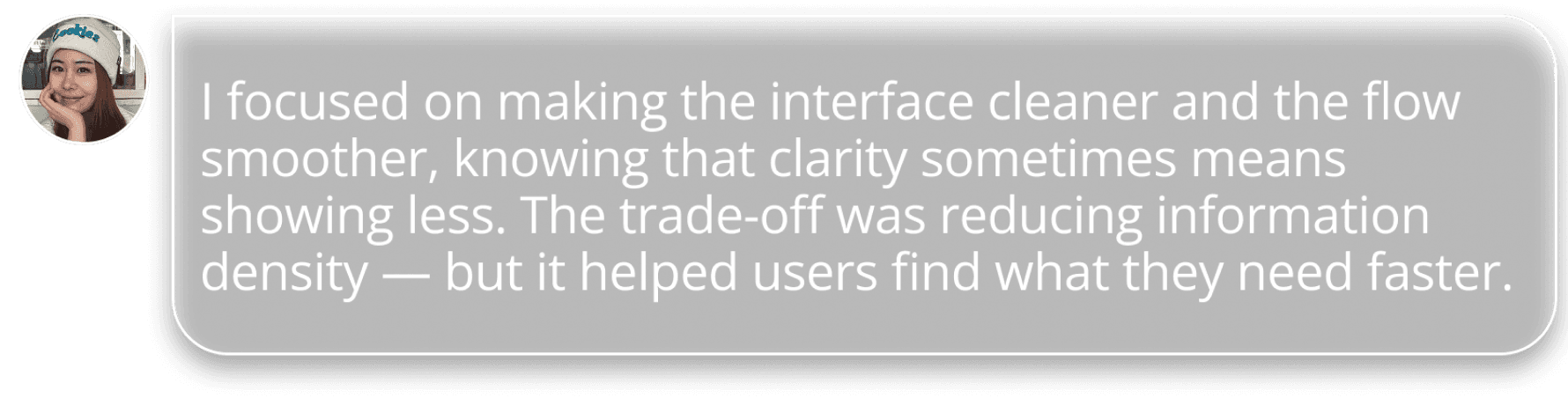
Original Layout


Content-driven Layout

New Problem
Text heavy & less information per screen


Refined Information Architecture
in consideration for product's scalability